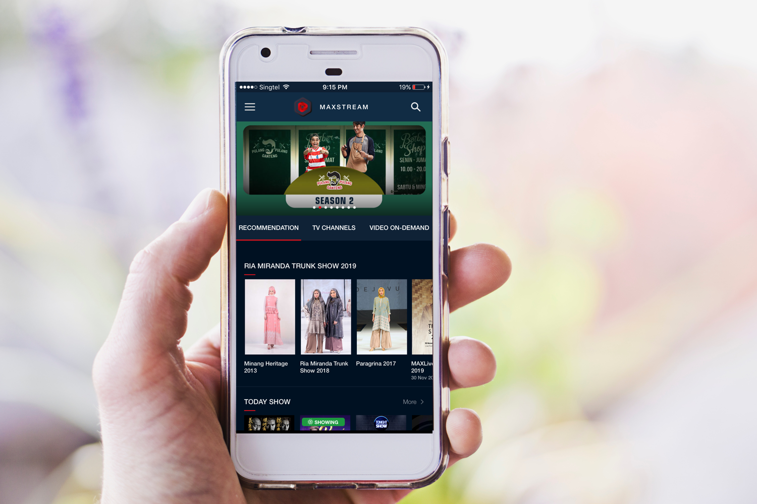
Maxstream
My role
User experience design
Company
Publicis.Sapient
Client
Telkomsel
The challenge
Telkomsel wants to capitalise on the increasing patronage of their customers who peruse their videomax data to stream content. This is reflected by the company's traffic data spike of 250% caused just by video streaming alone in 2017.
The outcome
Maxstream app is a one stop video stream portal where subscribers can access premium content as well as local freemium channels wherever they are.
A rising number of Telkomsel customers are watching premium channels on their mobile phones.
The mobile consumption of premium channels like Hooq and Viu especially is on all time high. As a response to this trend, Maxstream platform is designed as a one stop portal where subscribers can access premium channels. The platform offers more flexibility, choice and peace of mind by providing them with affordable data packages from partner channels.
Coordinating with the product owner, a fellow UX designer, 3 visual designers, 1 copy writer and a tech Ops, the design phase took a total of 2 months to complete. I led the UX design of all the following pages:
- Guest and member packages- buy and browse
- Guest and member video details for VOD, sports, movies and series
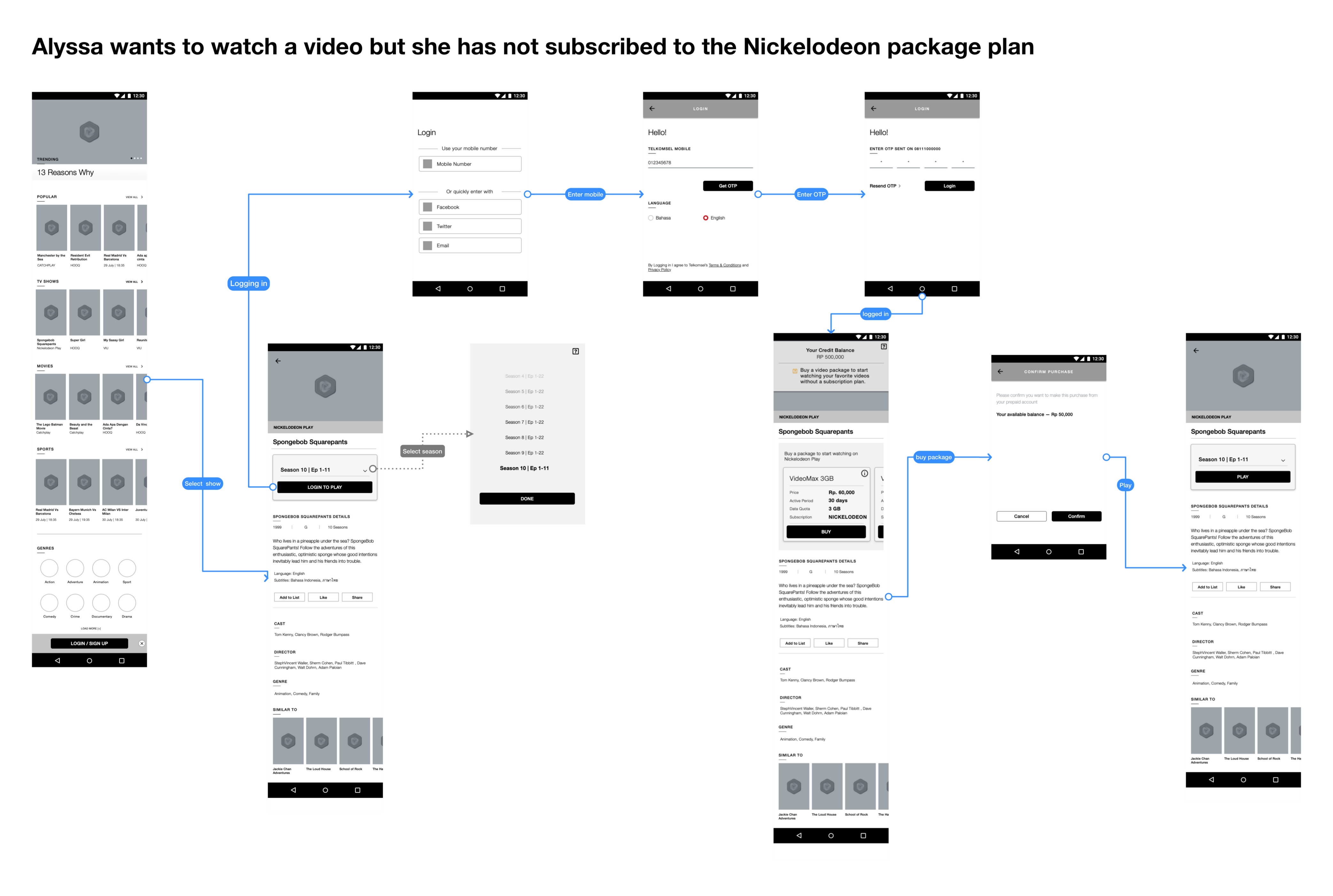
- video content subscription flow
- user engagement add on- like, share and save
- feedback page
- Support
- contact page
- search and search results
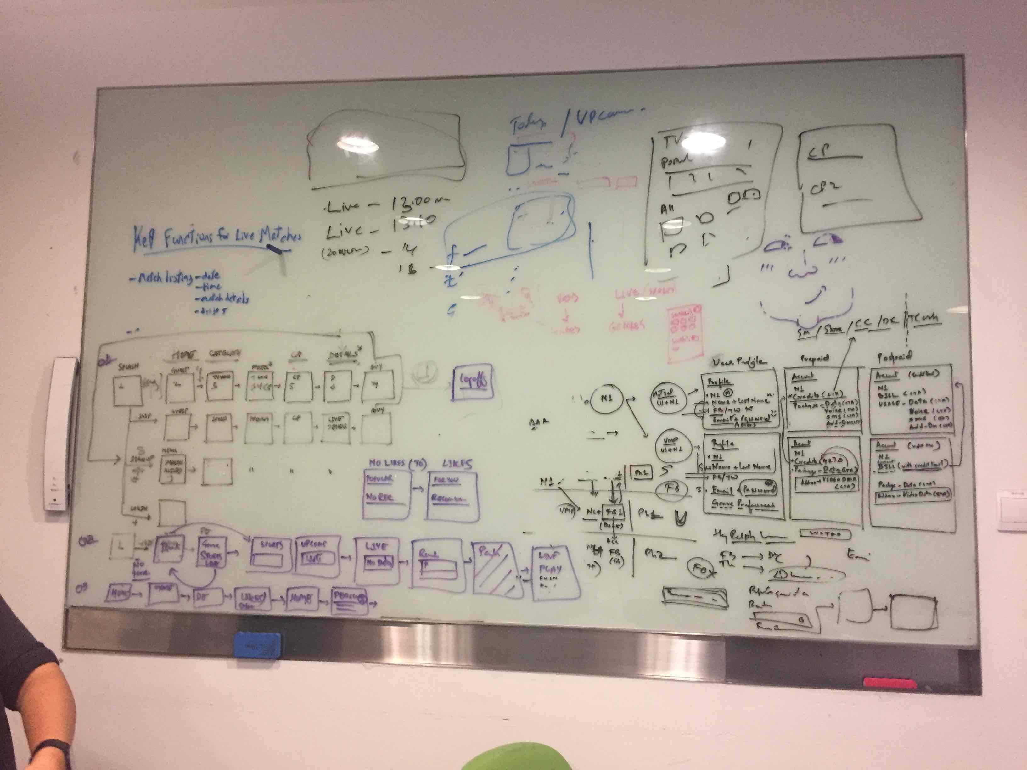
Right: Example of 1 user flow
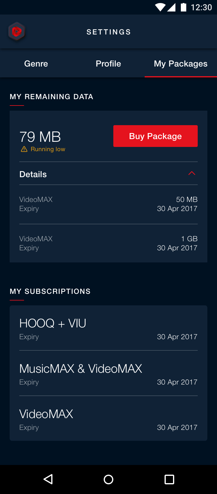
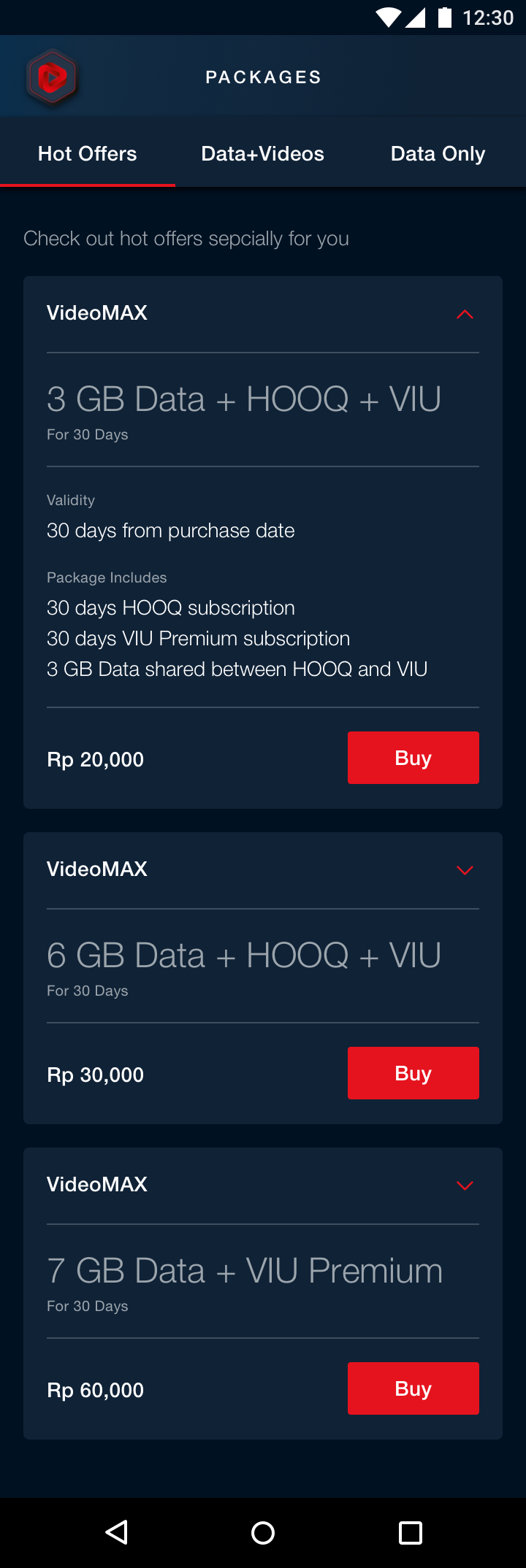
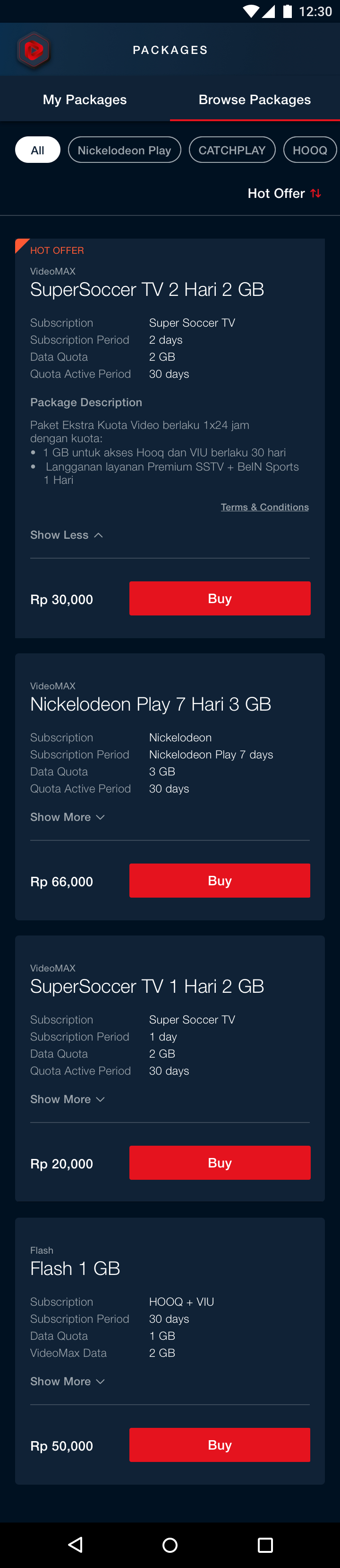
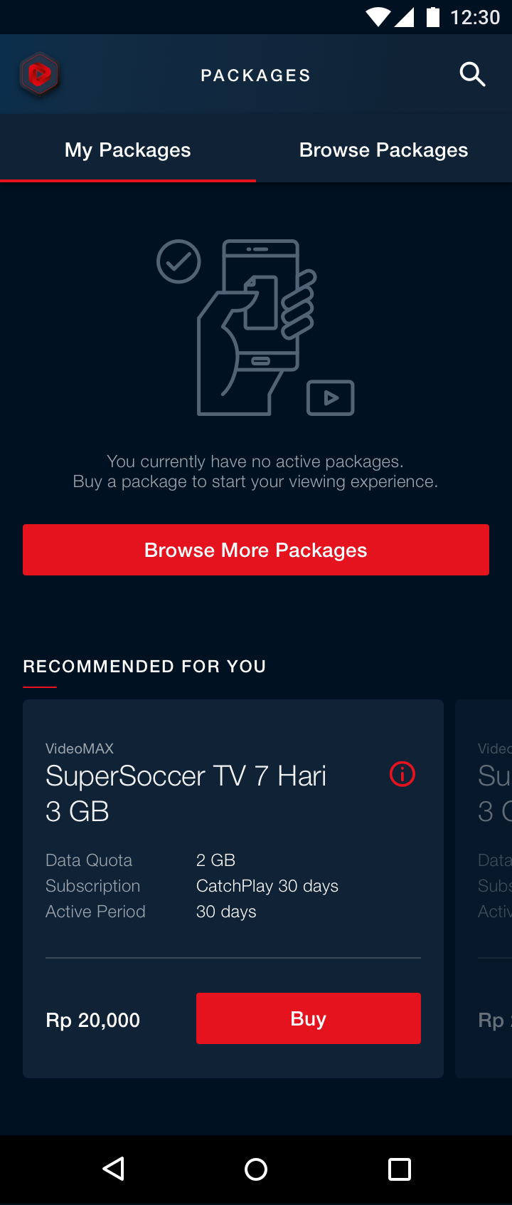
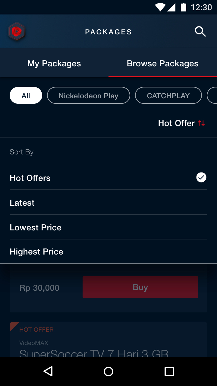
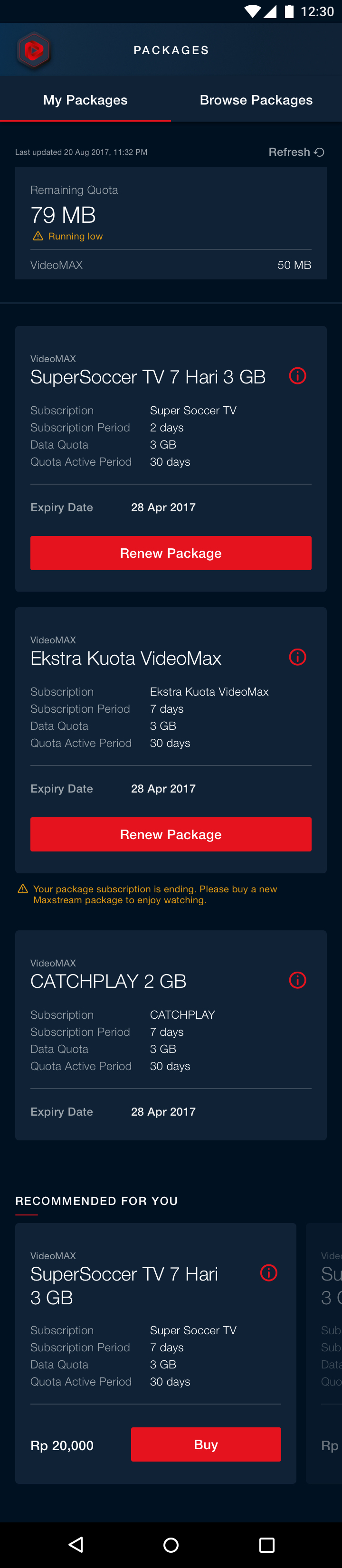
Browse and buy packages
Maxstream app offers different packages to suit a variety of viewing preferences. The card element is designed to include relevant bite size critical information regarding the package deal as well as a hassle free way to purchase it.

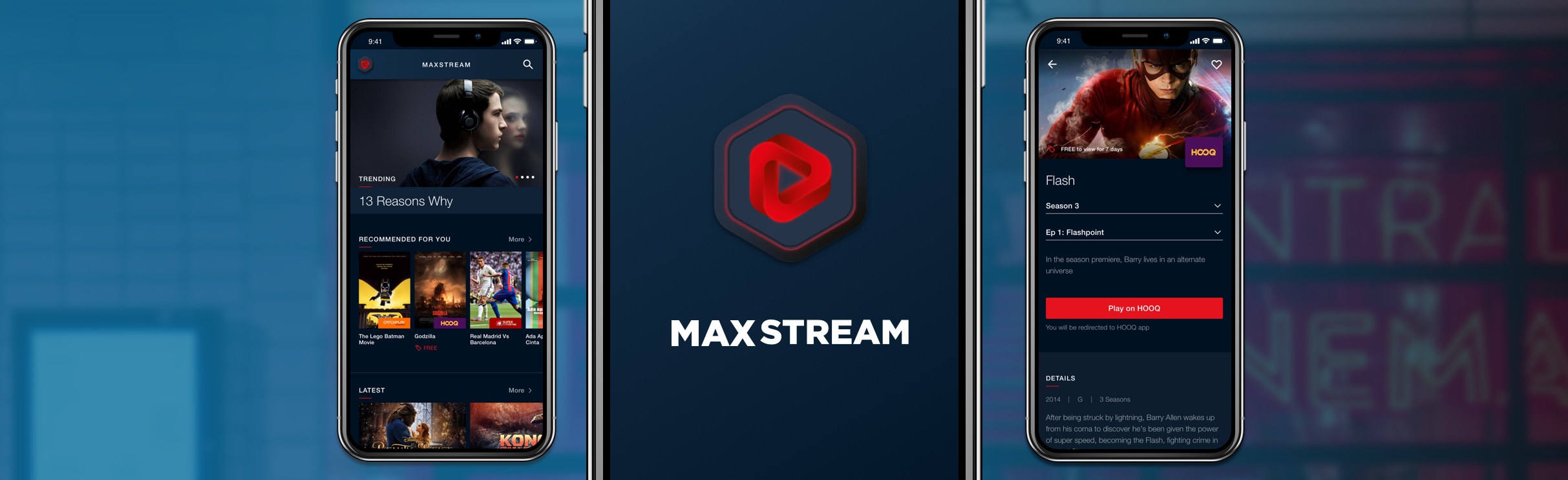
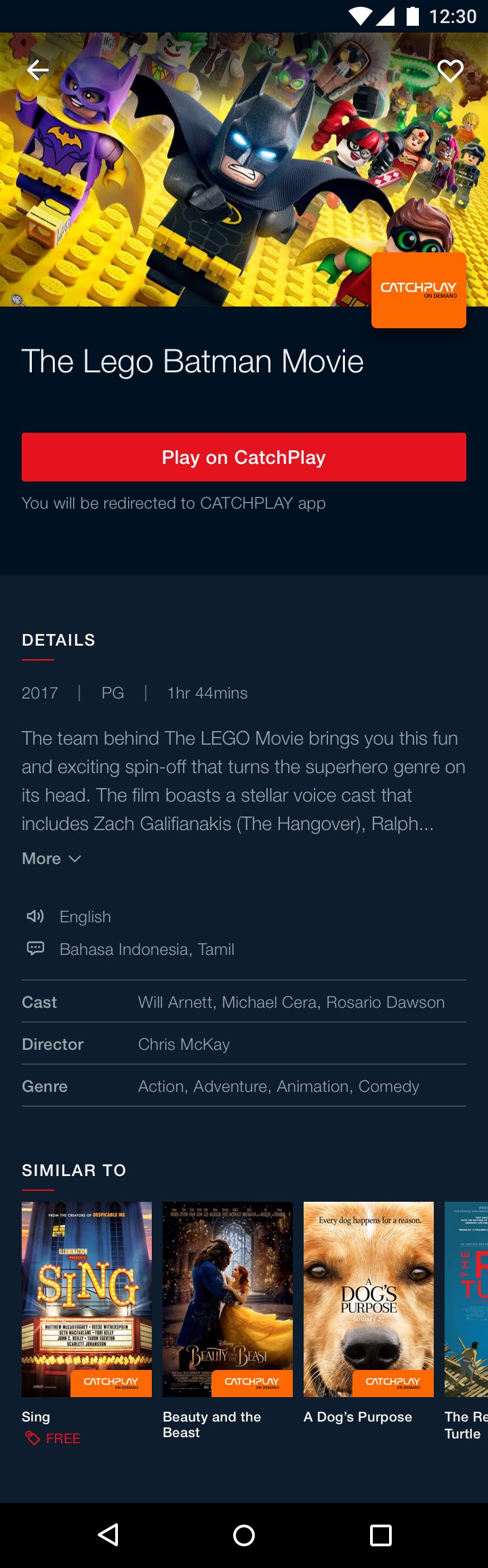
Video detail page
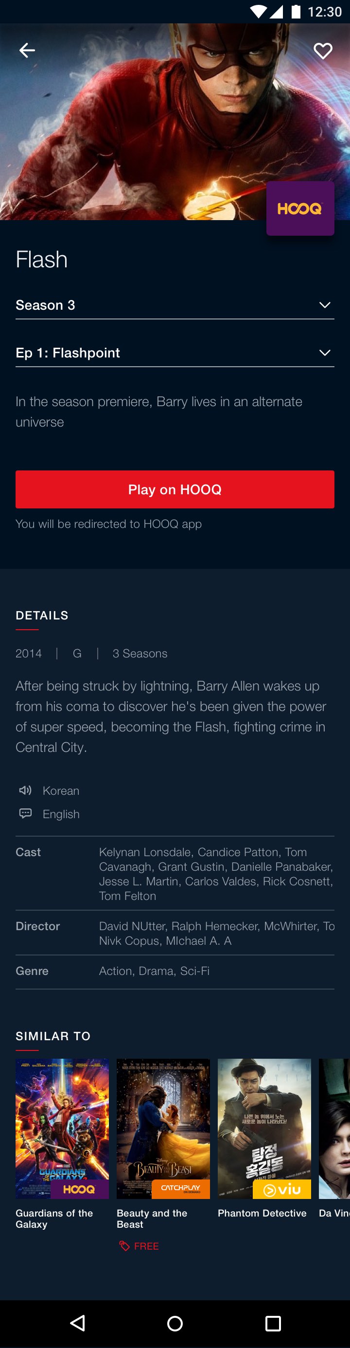
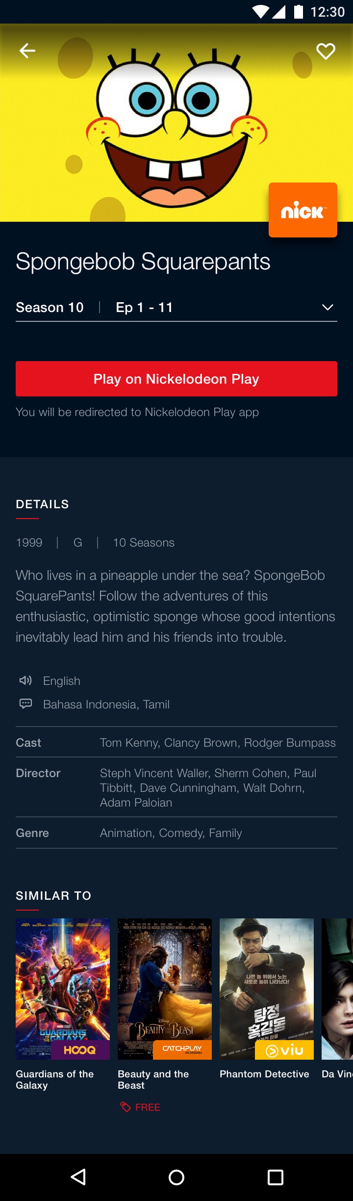
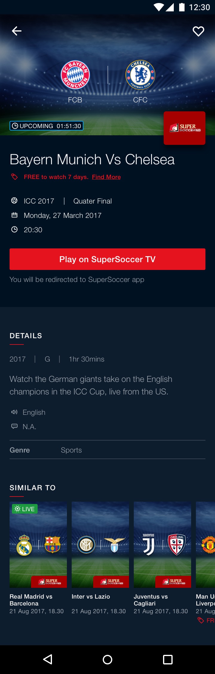
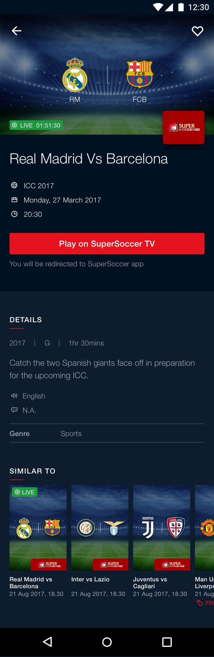
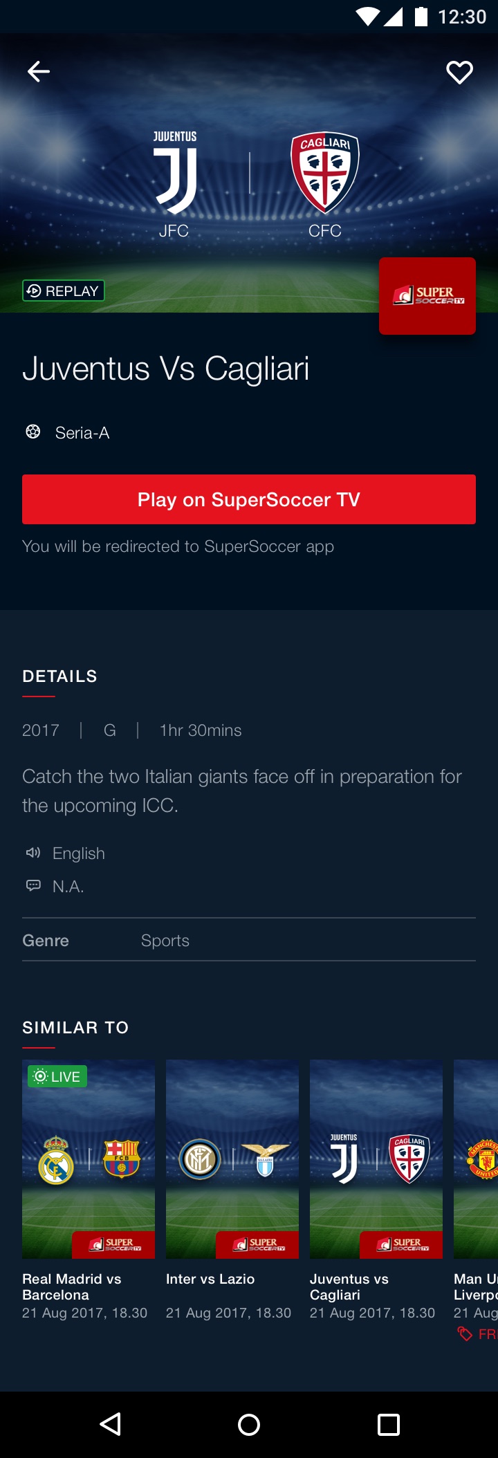
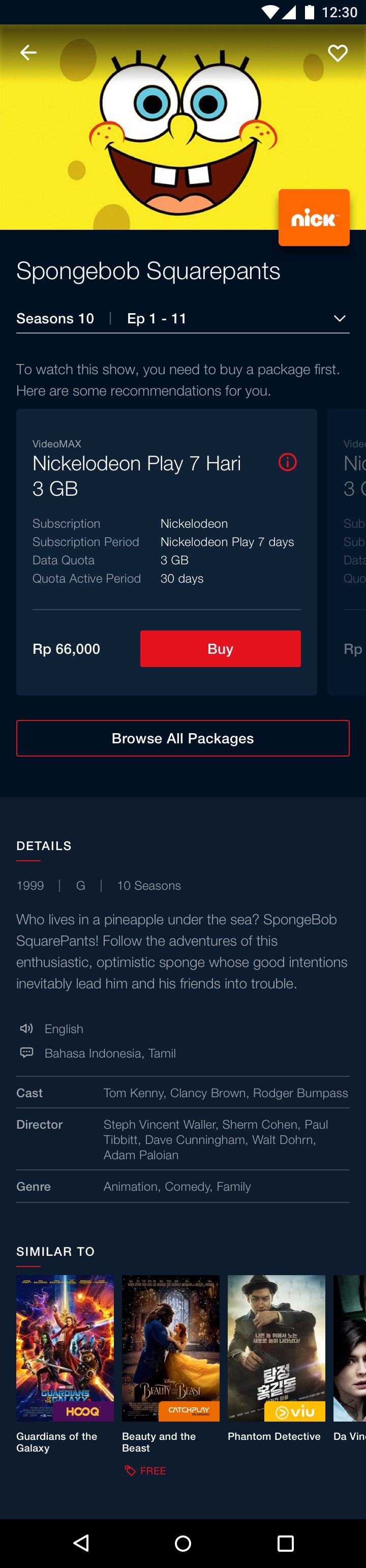
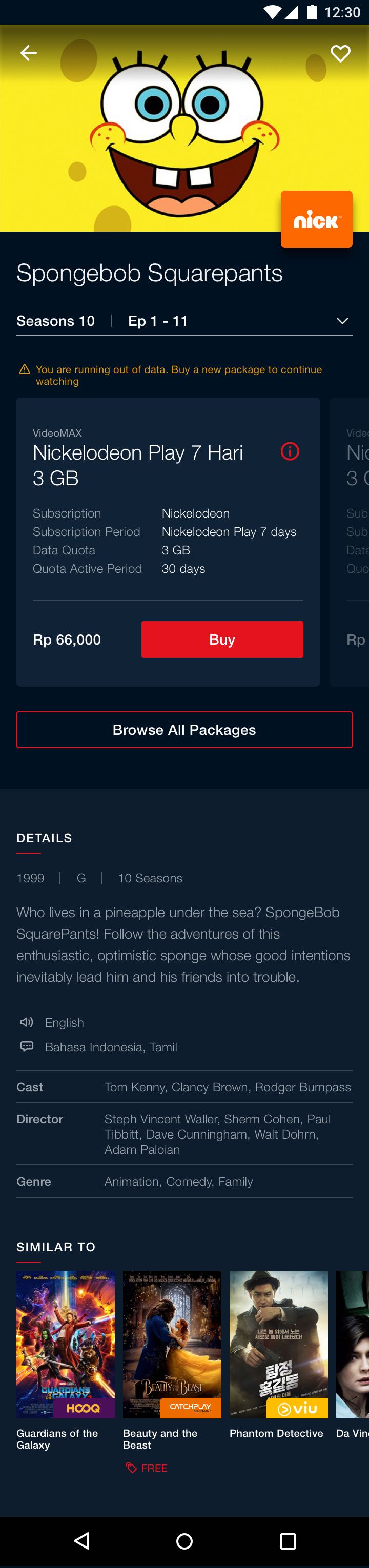
With several network channels within a single app, each client have their own unique way of grouping the seasons and episodes. A few variations of the video detail page were designed to cater to these business requirements without affecting the consistency of the overall video detail page. I also had to cater to the unique requirements of a live sports event, which is eventually divided into 3 different variations: upcoming, live, replay.
From left: Video detail page for movie, season+episode and season only. A discrete but still visible brand label is placed on the bottom right corner of the hero banner to identify the different premium channel.
From left: upcoming, live, replay. Instead of a usual generic soccer match banner, the hero banner for Super Soccer channel consists of two competing soccer club logo, giving more visibility to the match being telecasted.
From left: The behaviours that I designed for when a video package had not been bought or when the package is low. This allows for a frictionless viewing flow where users are able to buy the packages within the same video details page without going to the "browse packages" listing.
Reflections
MVP changes
For the first MVP drop, due to development constraint and speed to market, the package flow underwent a change during QA after the UX phase was completed.
- 'Browse packages' and "My packages" were separated into individual screens.
- The redesigned package card hides the crucial product description details within the more button.
These were unfortunate. If these issues were raised during the sprints, a better middle ground could have been reached.