
Globe Telecom
My role
User experience design
Company
Publicis.Sapient
Client
Globe Telecom
The challenge
Globe site was beginning to look dated as compared to its competition. The mobile site wasn't optimised for the prepaid users who make up a large portion of their customer base.
The outcome
The new site positions Globe as an all in one shop for digital communication, entertainment and business needs. Designed mobile first, the interface appeals to the young savvy users by promoting packages that is intuned to their current digital needs.
In early 2017, I was part of the creative team who were responsible for redesigning Globe website.
Working in a multidisciplinary team of experience, visual, content and tech, I was in charge of the user experience of the domains highlighted in blue. Below are just a few of the changes we shipped.

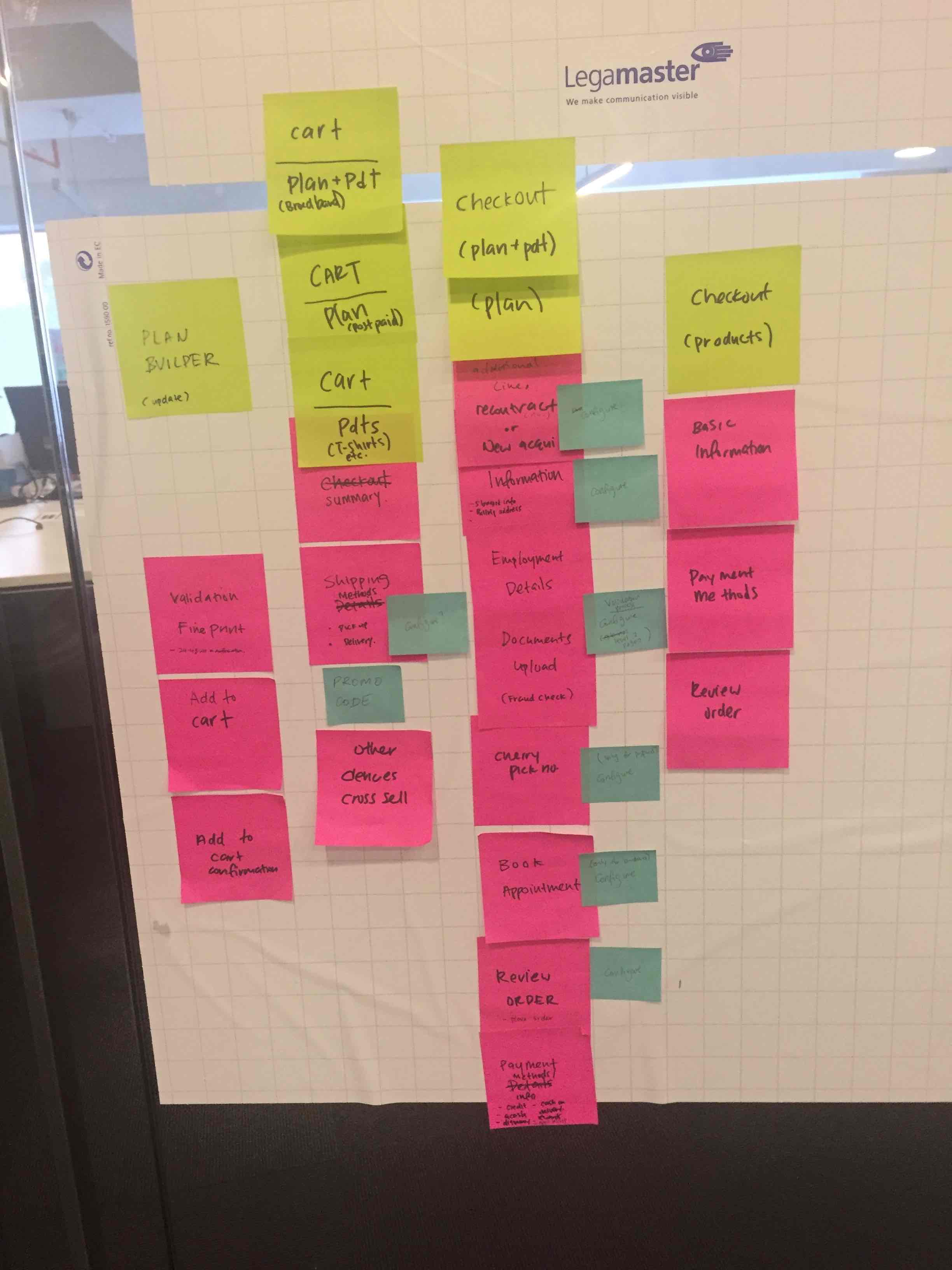
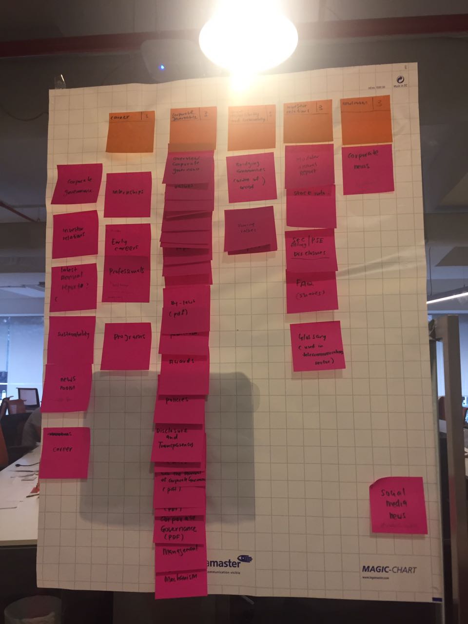
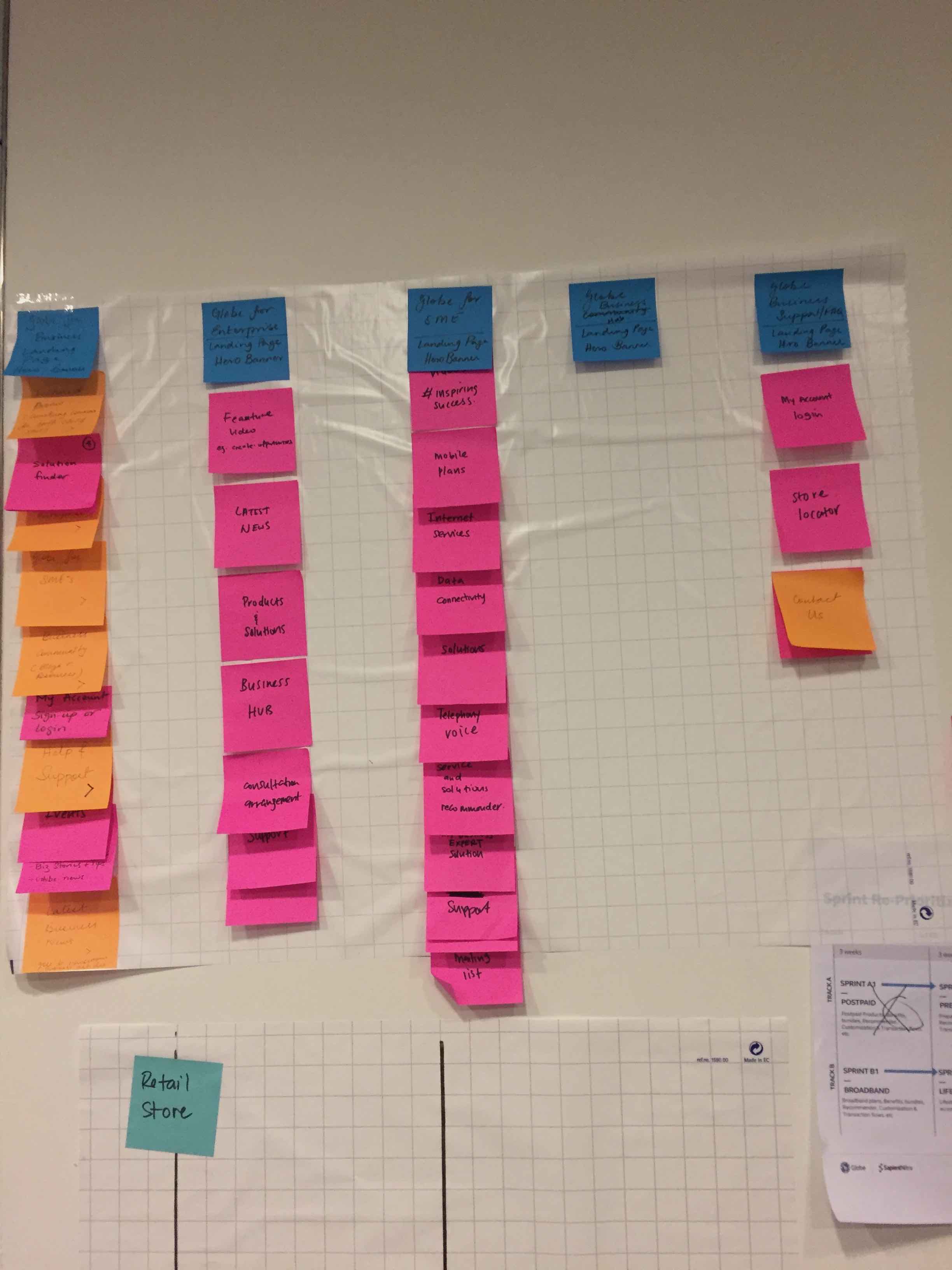
WIP Info architecure for some of the domains I worked on.
from left: 1. plan builder +checkout process, 2. About Us 3. Globe Business
100% responsive
From small screens to big, the Globe new site is designed to look great everywhere.
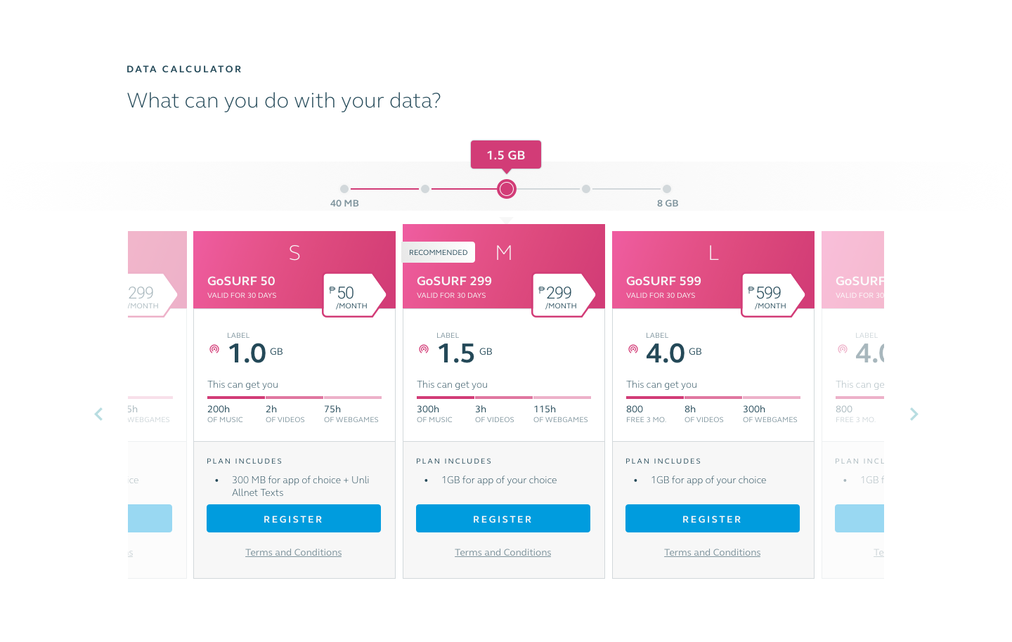
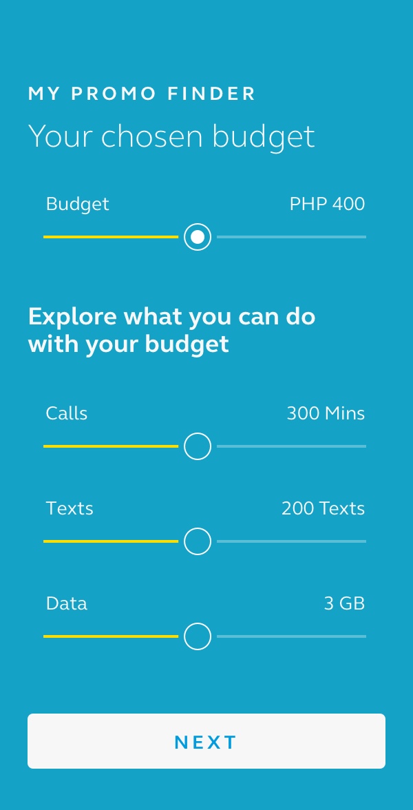
Highly customizable plans
Content streaming and viewing are one of the core activities of Filipino mobile users in a country where 87% of the households still has no access to internet broadband at home. With prepaid customers making up 45 percent of their total subscribers, it's no longer enough to offer fixed mobile plans. Globe users want more choices and control over their plan usage. With this in mind, we designed elements that give the users the power to customize and be in control of their plan.


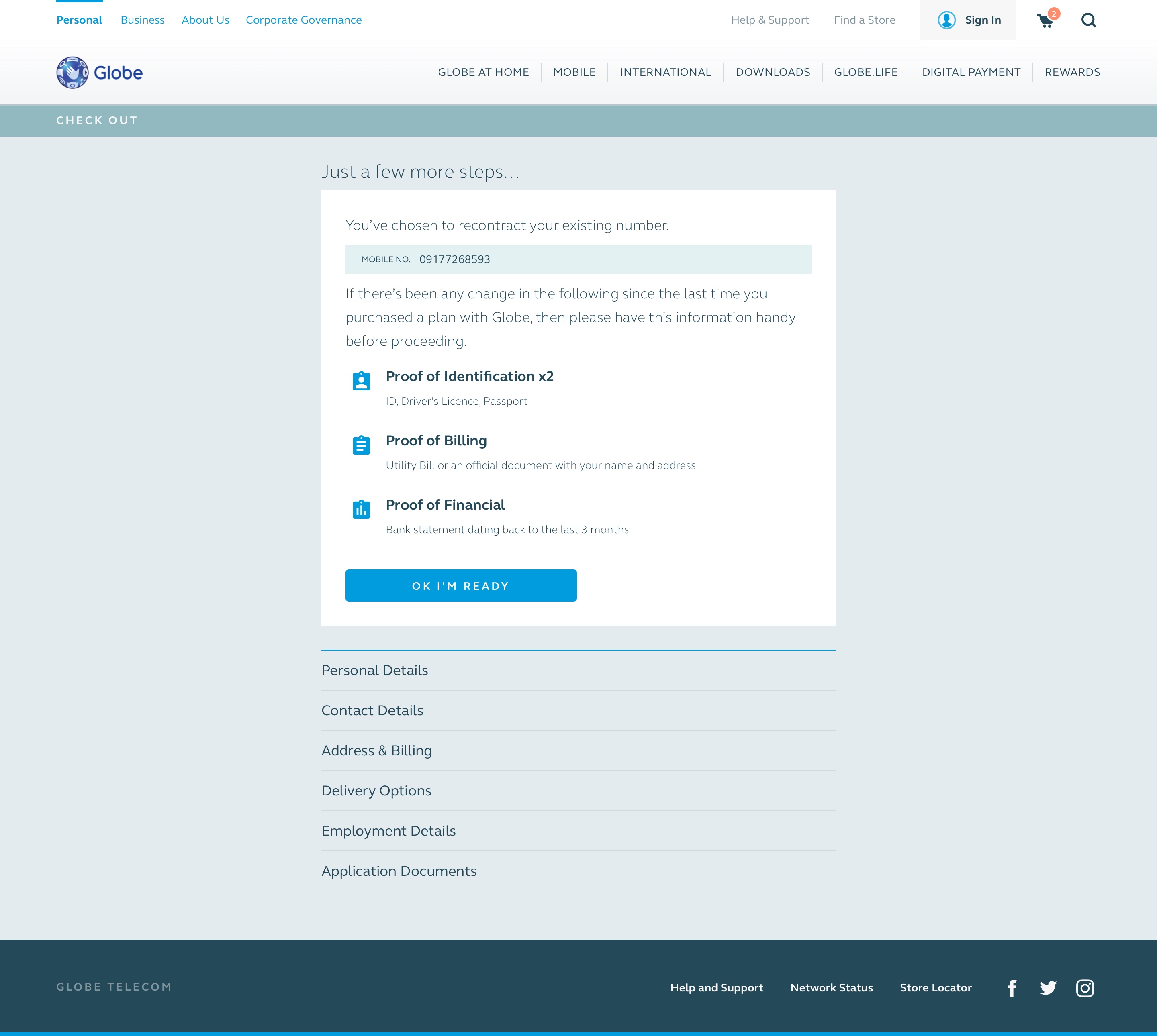
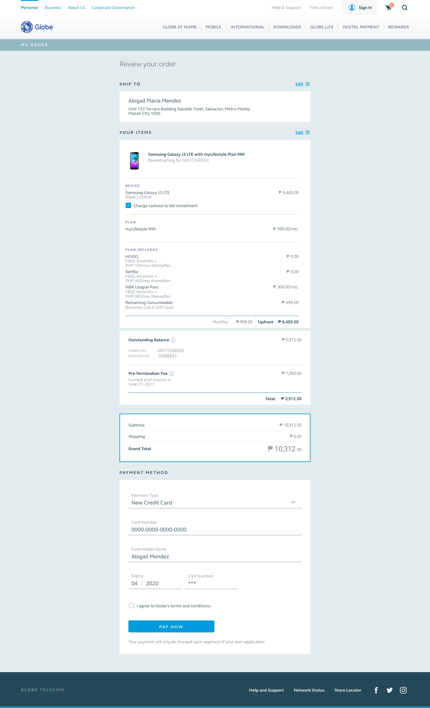
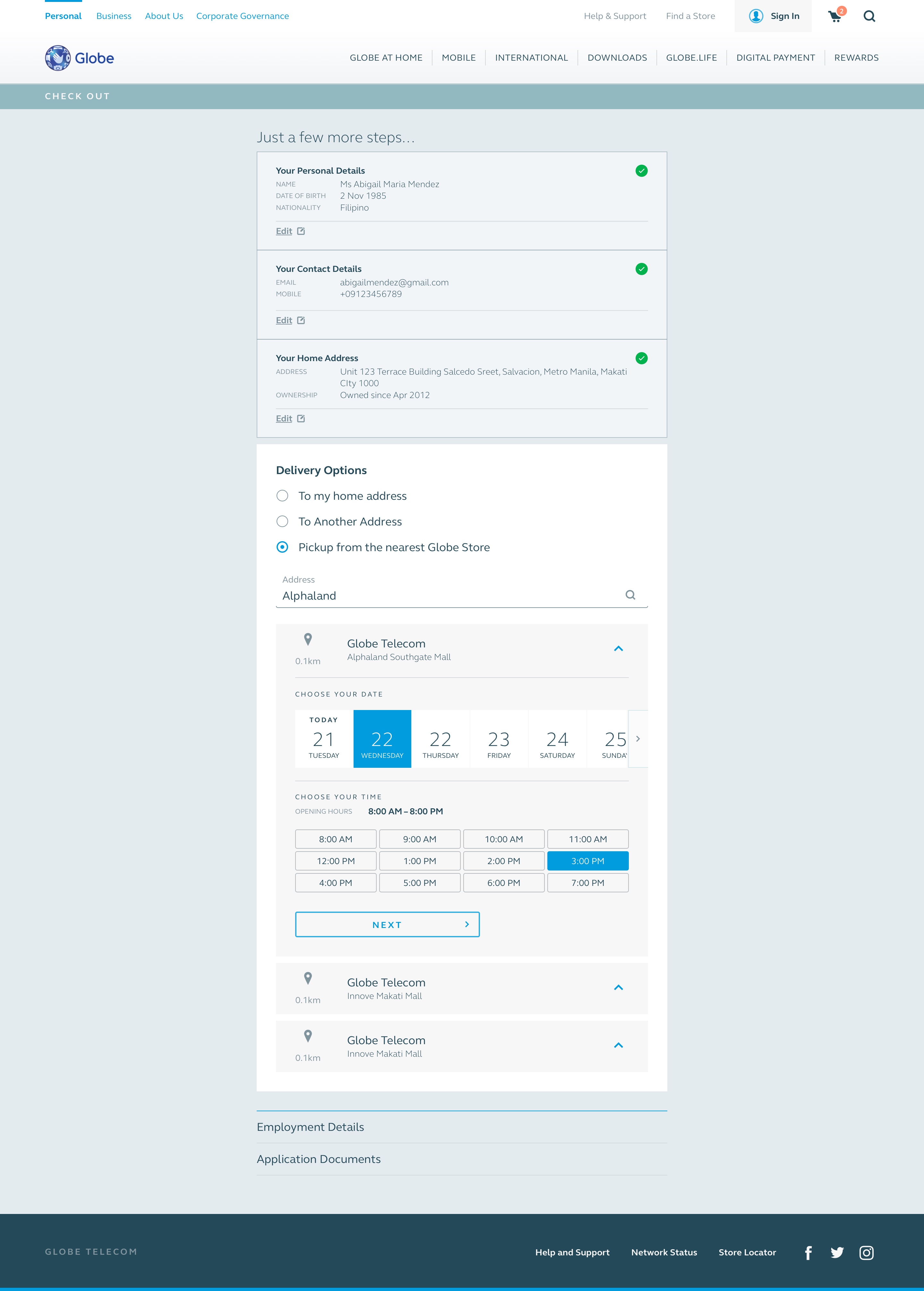
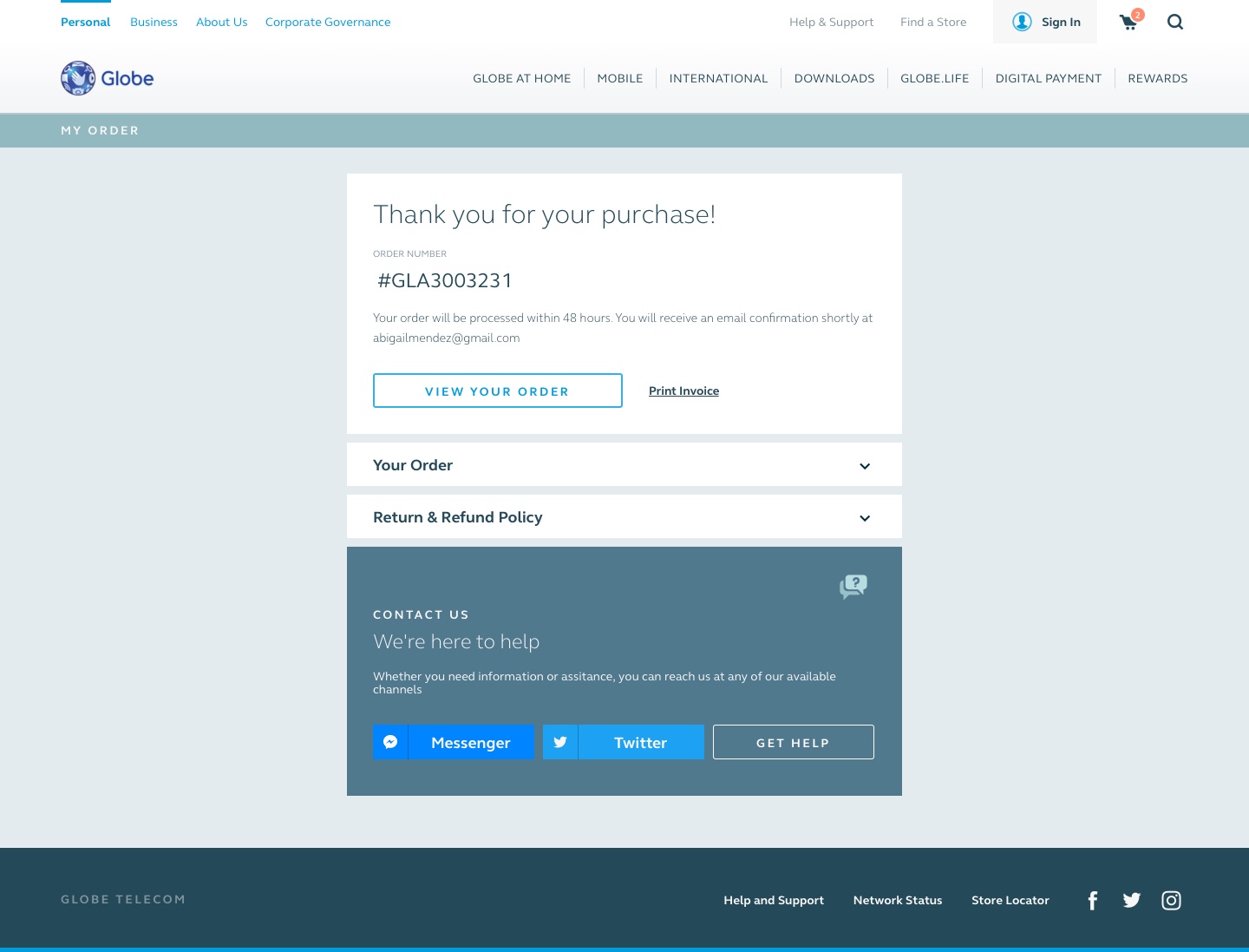
A painless checkout experience
The old checkout process requires users to move from one page to another, with no indication of an end to the process. The new design sets the user's expectation of what is needed to complete the checkout and the number of steps to be completed. The new checkout layout also allows them to re-edit fields easily within a single seamless flow.
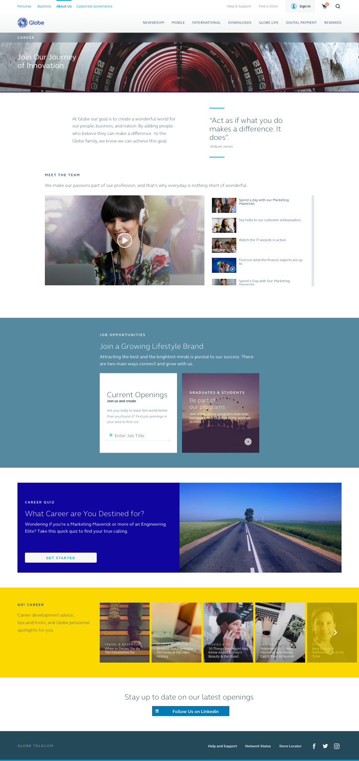
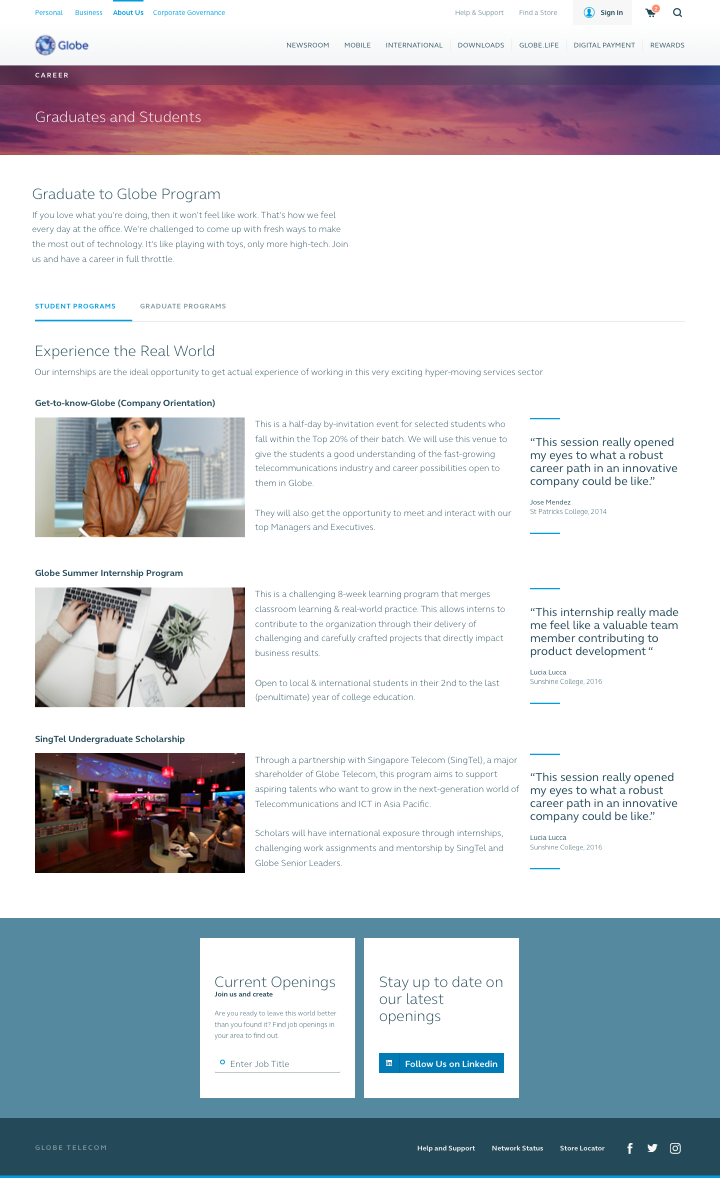
Attracting Talents
Globe wanted the site to recruit top talents, and these talents can be found in young people. The homepage showcases video reels of actual Globe employees in their respective team and operations. Globe's graduate & student programs get their own sections to give potential recruits an idea on what to expect.
Reflections
Hierarchy issues with plug and play approach
A couple of years after this site went live, there were hierarchy and alignment issues due to the way that the component library were used, resulting in a messy browsing experience. Perhaps, there could have been a retainer fee with the design agency to ensure that proper user experience guidelines were met in creation of new pages.